My new art blog is up and running in a bit of a “soft launch” or maybe more appropriately “in beta”. If you’ve stumbled across this blog looking for my art, please head on over there and let me know what you think.
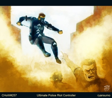
Character of the Week # 257 : The ultimate police riot controller
Last week’s CHoW was to design the ultimate police riot controller, rather timely considering the events in Jolly old England these past few weeks. I wasn’t sure if I was being too clever, but since my initial impulse (and I assumed everyone else’s would be as well) was to go for a bulky riot cop in full riot gear I went in the exact opposite direction. My riot controller would be a parkour practitioner, able to jump from building to building over the rioters while dropping teargas canisters and closing in on the ringleaders of the riot to take them out with electric batons.
Wips and front/back views
Not sure how I’ll fare this week. I was a little miffed that a lot of the challengers didn’t quite follow the “no sci-fi” bit of the brief, which I took great pains to adhere to. As a result i feel like there were quite a few entries this time around that had really awesome designs that just don’t exist in the current/near future world. Next week should be a little more fun, since the theme is alchemist cowboy.
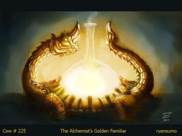
Creature of the Week #225 : Yng-sens’s Vyrner
The Oriental alchemist’s Yng-sen had little luck in his previous experiments, mostly because he insisted on using cow’s dung as the basis for his research into the fabled Philosopher’s stone. He finally met with success one day when the village children replaced the cow dung with some of their own as a practical joke, producing not only the Philosopher’s stone but a magical golden creature that would be heavily involved in his future experiments involving cow urine.
IoW Banner finished
This is the final artwork I submitted for the IoW banner challenge. I’m wracking my brain trying to find a way not to say “I’m quite pleased with it” because that’s what I always say, so I’ll settle on the fact that I’m happy with my progress so far though I can see a few areas where I could have made the image read better. Foremost is that while it’s ok to make changes midstream, I should have taken into account the placement of the text and smoothed out the forms of the bearcubs much sooner. I ended up having to do very slapdash fixes much later on, which is never advisable.
IoW Banner WIP
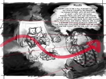
The Illustration of the Week challenge has opened up on the conceptart.org forum, and for the first week we’re suppose to come up with a banner that lists all of the rules of the challenge. The banners are usually illustrations in and of themselves, and it comes with some prestige because everytime a new challenge is posted the banner will be the first thing people see. I’m very skeptical my work will be chosen, but I’m hoping I can pull out something decent. The image above is the first few sketches I made. I was inspired by the idea that illustration is “storytelling”, so the first thing that came to mind was someone telling campfire stories. For whatever reason, I’d first imagined dwarves being the characters.

Here’s the first roughs in Photoshop, jsut laying down the basic shapes and some values. I’m experimenting with the chalk “brush” here, which is very useful for laying down values.
I dropped the dwarves pretty quick mostly because I couldn’t figure out how to draw toddler dwarves with beards that looked like they weren’t old men. Anyway, bears are cuter than dwarves, and lumBEARjacks are the best! I’m trying to create some flow in the scene, after having watched Jason Manley’s very educational series on the basics of design. It’s something I’ve known for a while but for some reason hasn’t stick to me till now. I’m also using very basic perspective to help sort out the placement of the characters and give the image a little more depth.
At this point I’m almost done. All that remains is to add some color and do some cleaning up. I’ve made quite a few changes here, like moving the rabbit up behind the dog, replacing the nebulous creature behind the tent with a chimp (Yes, I just watched Rise of the Apes) and an owl, so the bearcubs look like they have a bunch of little friends with them listening to their father lumbearjacks’ story. I’ve introduced a lot of foliage into the scene (I still don’t know how to control that. :|), made one bearcub look interested and the other one afraid for some contrast, and also fixed the father bear’s hands so he looks more like he’s telling a story than trying to strangle someone.
I’m kind of stressed out about this because I think it looks really nice (at least Aissa thinks so) but I feel like something’s still wrong. Hopefully when I put this up on the conceptart forums someone will be able to point out the glaring mistakes. In any case, I have till this weekend to work out the kinks before final submission and voting.
Warhammer 40k Space Marine Tutorial
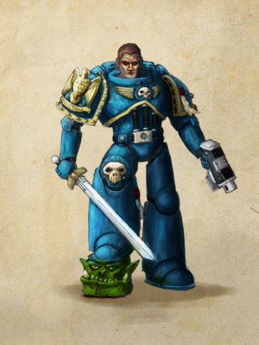
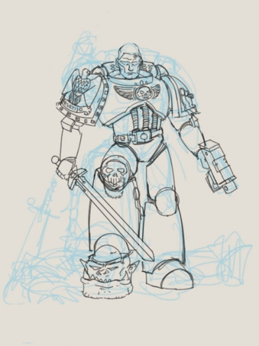
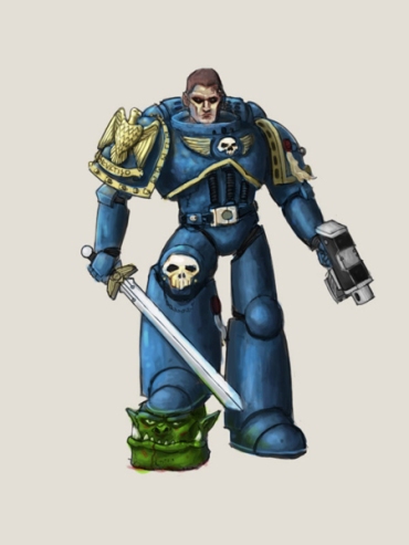
I hesitate to call this a tutorial because frankly I don’t think I’m at the point where I should be “teaching” anyone how to create artworks, but I figured that “Warhammer 40k Space Marine Step-by-Step Process” would have been a far too unwieldy title. This wasn’t for a client, but was more of a challenge to myself that I could theoretically make the leap from pen and ink illustrations into “painted” illustrations. There’s a pretty huge gulf between the two in terms of skillsets, though I’m of the opinion that good drawing skills are important for both. Really good painters will have already internalized the drawing process and can just slap digital paint onto their canvas and create forms out of them, but since I’m still transitioning here’s yhe roundabout way I got to the image above.
1. Thumbnails and quick sketches: I actually made 3 or 4 sketches before settling on this one. Unfortunately I have the tendency to delete sketches after I’m done with them. There’s no particular reason to sketch in blue, just pick a color that isn’t black because you’ll be sketching over this.
2. A tighter sketch: I set the blue sketch layer below to around 30% opacity so that it’s easier to sketch over. You’ll notice that I actually changed a lot about the thumbnail sketch here. I the original sketch the marine was standing over the ork’s body and holding out its head like a trophy. Because I was in more of a hurry to get to the process of rendering the painted piece I changed things up so that I wouldn’t have to draw the ork body anymore. This isn’t exactly the best move to make all the time, but you should always keep yourself open to changes, especially in the earlier steps of the process. The later on you make these types of changes, the harder they’ll be.
3. Layingdown flats: I lay down flat colors in a layer underneath the line art to give the image shape. The concern here is not details but blobs of light and dark to give the image some volume. Someone who is better at color theory than I am would lay down colored flats, but in this case I will be rendering in monochrome first before colorizing.
4.Rendering in monochrome: Here I’ll create a layer on top of the line art (so essentially painting over the line art and the flats) and start cleaning up the rough shapes laid down with the flats. This is probably the most time-consuming process of the whole thing, and in may ways is sort of the point of no return. Once you get into this it’ll be really hard to make changes so make sure you’re happy with the first three steps first. Again I was in a bit of a hurry here, and later on I’ll be tightening things up that should have already been done in the first place, but we’ll get to that later. Btw for painting here I’m just using a hard round brush (the basic photoshop brush) with opacity and flow set to pen pressure, and will continue to use this brush throughout the process.
5. Colorizing: I create a layer on top of the rendered monochrome layer and set layer properties to hard light. I will use this layer to lay colors on top of the monochrome image, again using a round brush. It’s not seen here, but I also had a “palette” layer on top of the hard light layer. It’s important to have this because once you paint on the hard light layer you can’t simply use the eyedropper tool since your color has already changed (by virtue of “hard light” mixing it with the colurs below). In any case it’s always good to have a palette layer as a reference for your colors.
6. Saturation: I felt that the colors were a little too unsaturated, so I duplicated the “hard light” layer, set it to “soft light” then messed around with the hue and saturation settings until I got a color that I was happy with.
7. Tightening: At this point I’m starting to get happy with the results, although there are still a lot of areas that could use tightening up (ie so that things don’t seem loose or hazy). I create another new layer on top of everything called “tightening” and I start going over details like the skulls, the faces of the ork and the marine, etc. I could have probably saved myself a lot of time by doing this tightening in monochrome so that I would have to be thinking about colors while I’m doing this. We’re in the home stretch now, and the next few steps are pretty straightforward.
8. Shadows by Multiply: I create another new layer on top of verything and set the layer properties to “multiply”. You generally do this when you want to paint over something and make it darker without necessarily affecting the rendering that’s already been done, sort of like painting shadows. Shadows, when placed strategically, are always a good idea because they give your artwork more depth.
9. Light by color dodge: Basically what i said for “multiply”, but this time with regards to light rather than shadow.
After that, I pick a nice scrolly texture from google image to slap on behind the marine and that’s that (scroll back up to see the results)! For reference, It took me about 8-10 hours over 3 -4 days to do this. That’s definitely way too long for a piece that’s theoretically as simple as this. Of course I was making a lot of mistakes along the way so I think I could eventually cut that to half the amount of time if I can keep making artworks like this. Anyway, hope some people found this tutorial useful!
Master Copies : Satsuma Gishiden
You can read more about Master Copies here, but essentially the idea of a master copy in art is to try to reproduce the artwork of an artist that you like in order to better understand why they drew/painted the artwork in a specific way. The idea isn’t just to replicate but to learn by doing this and thus grow as an artist. I must admit I’m skeptical as to whether or not this will actually work, but I’m willing to give it a shot anyway. These drawings were made with a combination of brush/fountain pen, and are the work of mangaka Hiroshi Hirata in book 2 of the Satsuma Gishiden.
Davy Raccoon’s Last Stand
This piece began as an idea for one of gameartisans’ sketch challenges, with the theme being historic deaths. I’d been on a cowboy kick recently and so I chose the Alamo, and specifically Davy Crockett’s death, as my subject. The history behind the fall of the Alamo is rich in detail, and I subsequently lost hours doing research into Texian (what the inhabitants of Texas then called themselves, feeling they were neither Mexican nor American) life, and the different people involved in the battle. To tweak things a little bit I decided to turn Davy Crockett into a Raccoon version of himself, in homage to his famous coonskin hat.
Davy is holding a flintlock “Kentucky” rifle, which I based on replicas made by Caywood guns. The man behind him is just a random Texian, but he’s very loosely based on James Bowie, who also died in the Alamo. By very loosely I mean I considered making that character actually BE James Bowie but decided that I didn’t want to bother with doing too much more research and being bogged down in making sure the character feels historically accurate. So I made him a random Texian and gave him two Kentucky flintlock pistols to match Davy’s rifle. I’d actually thought that they ought to be revolvers since in my mind the Wild West and the Alamo go hand in hand, but apparently the revolver only started becoming really popular a few years after the fall of the Alamo.
Here’s a couple of sketches I made before I started work on the final piece.
Raccoon Sketches
Texian Sketches
Layout Sketches
Curse of Crosskey Cover
Over the last 6 months I’ve been slowly inching my way into the world of illustrating for pen and paper RPGs. While game art has been paying the bills quite well, illustration work like this is really what I’ve always wanted to do. I’m also a little worried at how 3D is creeping into the iOS games which have been my bread and butter for the past two years, so having some sort of fallback plan is always good. It hardly pays as well and I’m light years away from having the stature or skill of someone who does artwork for say, Magic : The Gathering, but at least I have something to work towards.
This stone tower was used as the cover for Knightvision Games “Curse of Crosskey” module. Like I said, light years away. 🙂
Animated workflow
This is what Davy Raccoon was leading to. I really wish I had more time and energy to explain this workflow a little bit. I also really wish I’d found an style to embrace that didn’t take me goddamn long to finish a single piece. The final, colored version will be out soonish.
